Chart2D.scatter#
- Chart2D.scatter(x, y, *, color='b', size=10, style='o', label='')[source]#
Add a scatter plot to this chart.
- Parameters:
- xarray_like
X coordinates of the points to draw.
- yarray_like
Y coordinates of the points to draw.
- color
ColorLike, default: “b” Color of the points drawn in this plot. Any color parsable by
pyvista.Coloris allowed.- size
float, default: 10 Size of the point markers drawn in this plot.
- style
str, default: “o” Style of the point markers drawn in this plot. See ScatterPlot2D.MARKER_STYLES for a list of allowed marker styles.
- label
str, default: “” Label of this plot, as shown in the chart’s legend.
- Returns:
plotting.charts.ScatterPlot2DThe created scatter plot.
Examples#
Download Python source code | Download Jupyter notebook
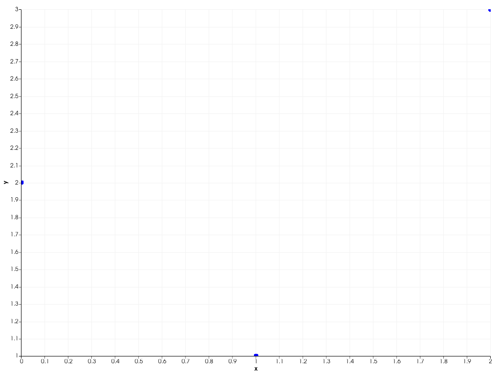
Generate a scatter plot.
>>> import pyvista as pv
>>> chart = pv.Chart2D()
>>> plot = chart.scatter([0, 1, 2], [2, 1, 3])
>>> chart.show()
Used In#
API Examples
Chart2D(1 use)ScatterPlot2D(1 use)ScatterPlot2D.brush(1 use)ScatterPlot2D.color(1 use)ScatterPlot2D.label(1 use)10 more
ScatterPlot2D.line_style(1 use)ScatterPlot2D.line_width(1 use)ScatterPlot2D.marker_size(1 use)ScatterPlot2D.marker_style(1 use)ScatterPlot2D.pen(1 use)ScatterPlot2D.toggle(1 use)ScatterPlot2D.update(1 use)ScatterPlot2D.visible(1 use)ScatterPlot2D.x(1 use)ScatterPlot2D.y(1 use)
Gallery Examples