Note
Go to the end to download the full example code.
Chart Basics#
This example shows how different types of charts can be added to the scene. A more complex example, showing how to combine multiple charts as overlays in the same renderer, is given in Chart Overlays.
import numpy as np
import pyvista as pv


rng = np.random.default_rng(
    1
)  # Seeded random number generator for consistent data generation
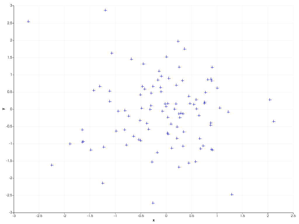
This example shows how to create a 2D scatter plot from 100 randomly sampled
datapoints using scatter(). By default, the chart automatically
rescales its axes such that all plotted data is visible. By right clicking on the chart
you can enable zooming and panning of the chart.
x = rng.standard_normal(100)
y = rng.standard_normal(100)
chart = pv.Chart2D()
chart.scatter(x, y, size=10, style='+')
chart.show()
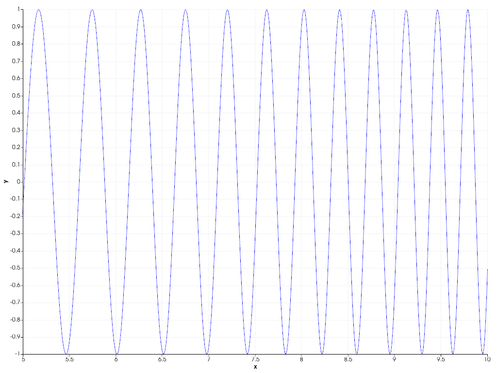
To connect datapoints with lines, you can create a 2D line plot as shown in
the example below using line(). You can also dynamically
‘zoom in’ on the plotted data by specifying a custom axis range yourself.
x = np.linspace(0, 10, 1000)
y = np.sin(x**2)
chart = pv.Chart2D()
chart.line(x, y)
chart.x_range = [5, 10]  # Focus on the second half of the curve
chart.show()
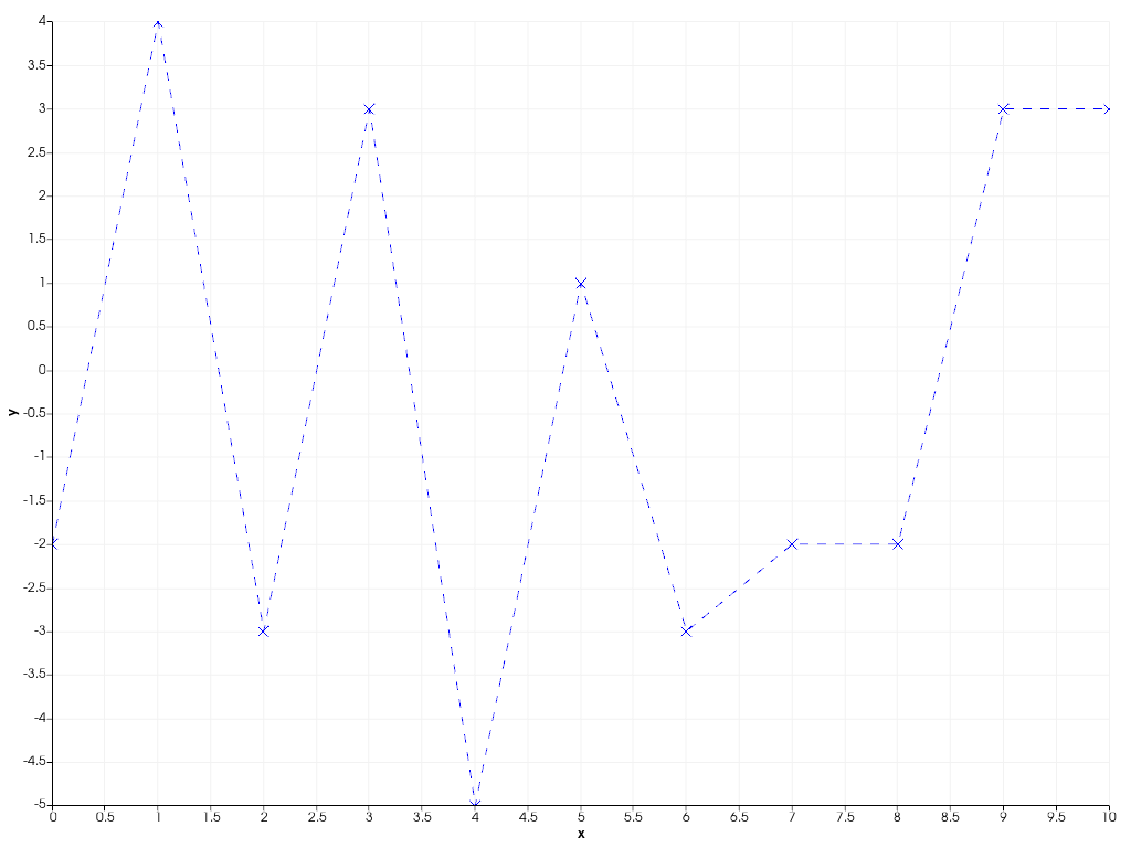
You can also easily combine scatter and line plots using the general
plot() function, specifying both the line and marker
style at once.
x = np.arange(11)
y = rng.integers(-5, 6, 11)
chart = pv.Chart2D()
chart.background_color = (0.5, 0.9, 0.5)  # Use custom background color for chart
chart.plot(x, y, 'x--b')  # Marker style 'x', striped line style '--', blue color 'b'
chart.show()
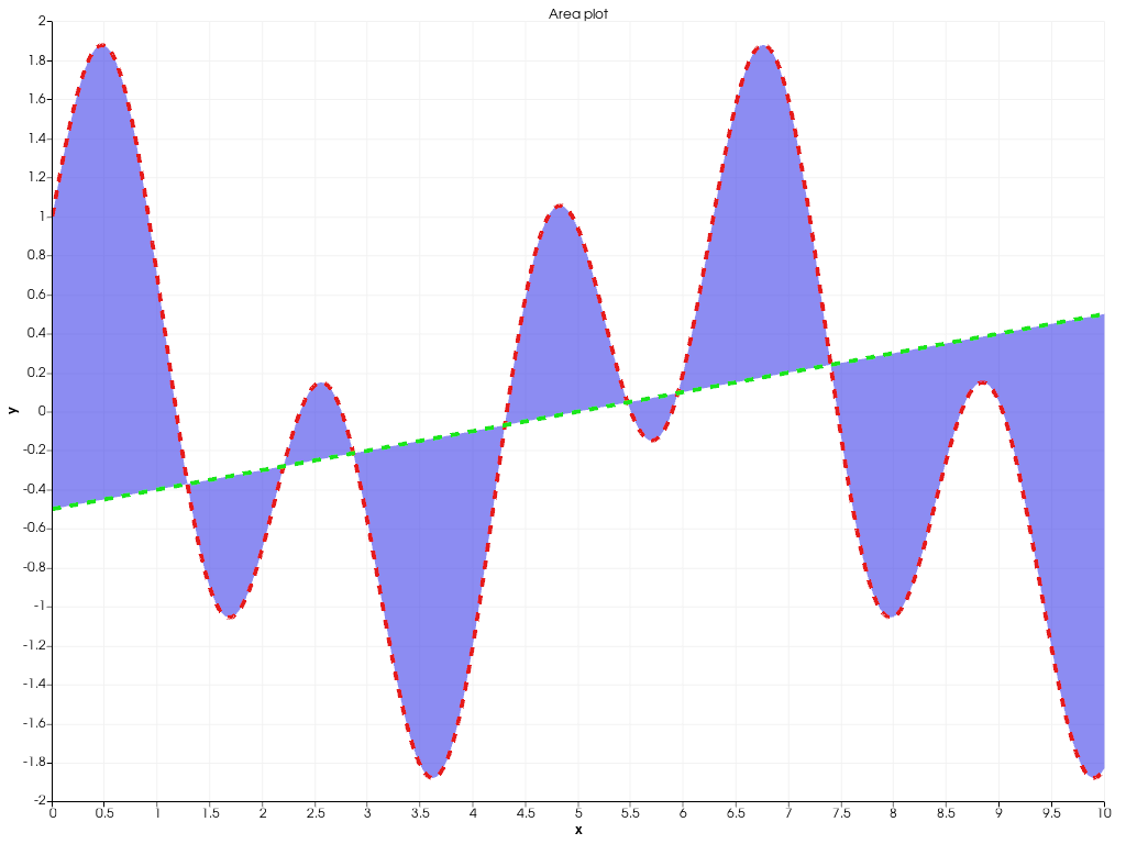
The following example shows how to create filled areas between two polylines
using area().
x = np.linspace(0, 10, 1000)
y1 = np.cos(x) + np.sin(3 * x)
y2 = 0.1 * (x - 5)
chart = pv.Chart2D()
chart.area(x, y1, y2, color=(0.1, 0.1, 0.9, 0.5))
chart.line(x, y1, color=(0.9, 0.1, 0.1), width=4, style='--')
chart.line(x, y2, color=(0.1, 0.9, 0.1), width=4, style='--')
chart.title = 'Area plot'  # Set custom chart title
chart.show()
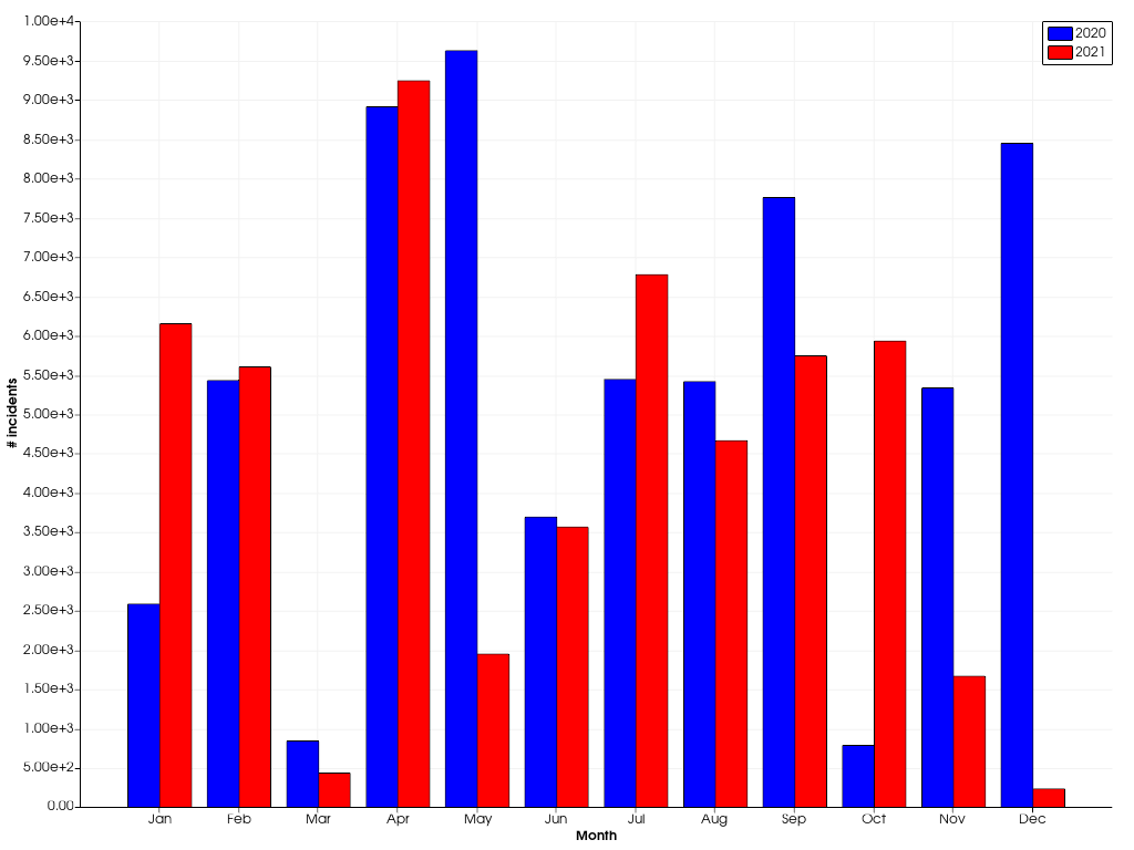
Bar charts are also supported using bar().
Multiple bar plots are placed next to each other.
x = np.arange(1, 13)
y1 = rng.integers(1e2, 1e4, 12)
y2 = rng.integers(1e2, 1e4, 12)
chart = pv.Chart2D()
chart.bar(x, y1, color='b', label='2020')
chart.bar(x, y2, color='r', label='2021')
chart.x_axis.tick_locations = x
chart.x_axis.tick_labels = [
    'Jan',
    'Feb',
    'Mar',
    'Apr',
    'May',
    'Jun',
    'Jul',
    'Aug',
    'Sep',
    'Oct',
    'Nov',
    'Dec',
]
chart.x_label = 'Month'
chart.y_axis.tick_labels = '2e'
chart.y_label = '# incidents'
chart.show()
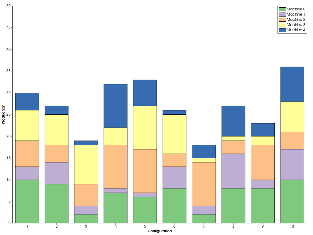
In case you want to stack the bars, instead of drawing them next to each other, pass a sequence of y values.
x = np.arange(1, 11)
ys = [rng.integers(1, 11, 10) for _ in range(5)]
labels = [f'Machine {i}' for i in range(5)]
chart = pv.Chart2D()
chart.bar(x, ys, label=labels)
chart.x_axis.tick_locations = x
chart.x_label = 'Configuration'
chart.y_label = 'Production'
chart.grid = False  # Disable the grid lines
chart.show()
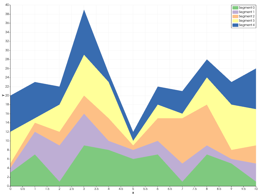
In a similar way, you can stack multiple area plots on top of
each other using stack().
x = np.arange(0, 11)
ys = [rng.integers(1, 11, 11) for _ in range(5)]
labels = [f'Segment {i}' for i in range(5)]
chart = pv.Chart2D()
chart.stack(x, ys, labels=labels)
chart.show()
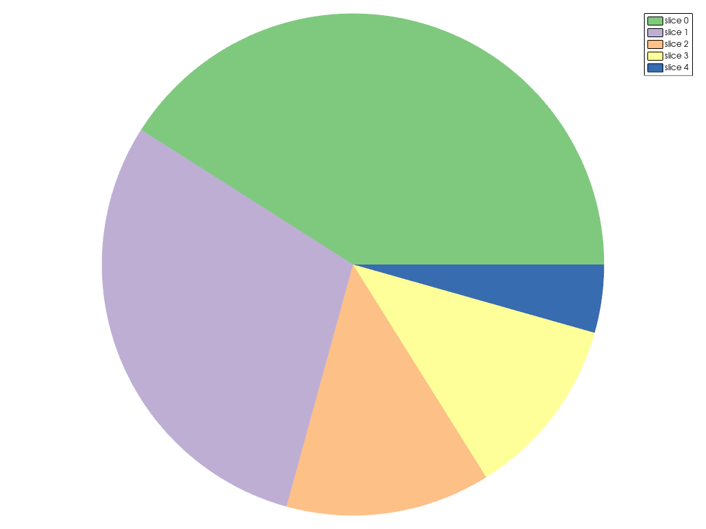
Beside the flexible Chart2D used in the previous examples, there are a couple
other dedicated charts you can create. The example below shows how a pie
chart can be created using ChartPie.
data = np.array([8.4, 6.1, 2.7, 2.4, 0.9])
chart = pv.ChartPie(data)
chart.plot.labels = [f'slice {i}' for i in range(len(data))]
chart.show()
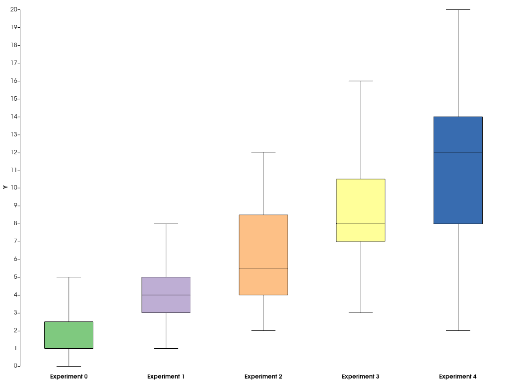
To summarize statistics of datasets, you can easily create a boxplot
using ChartBox.
data = [rng.poisson(lam, 20) for lam in range(2, 12, 2)]
chart = pv.ChartBox(data)
chart.plot.labels = [f'Experiment {i}' for i in range(len(data))]
chart.show()
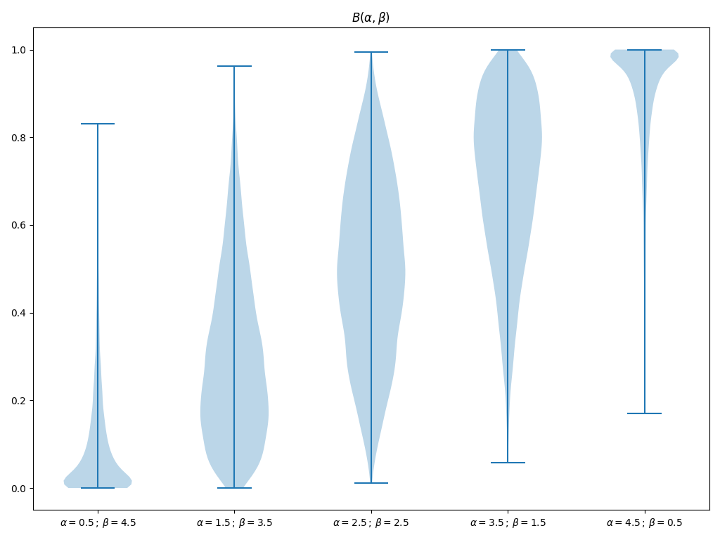
If you would like to add other types of chart that are currently not supported by pyvista or VTK, you can resort to matplotlib to create your custom chart and afterwards embed it into a pyvista plotting window. The below example shows how you can do this.
import matplotlib.pyplot as plt

# First, create the matplotlib figure
f, ax = plt.subplots(
    tight_layout=True,
)  # Tight layout to keep axis labels visible on smaller figures
alphas = [0.5 + i for i in range(5)]
betas = [*reversed(alphas)]
N = int(1e4)
data = [rng.beta(alpha, beta, N) for alpha, beta in zip(alphas, betas, strict=True)]
labels = [
    f'$\\alpha={alpha:.1f}\\,;\\,\\beta={beta:.1f}$'
    for alpha, beta in zip(alphas, betas, strict=True)
]
ax.violinplot(data)
ax.set_xticks(np.arange(1, 1 + len(labels)))
ax.set_xticklabels(labels)
ax.set_title('$B(\\alpha, \\beta)$')

# Next, embed the figure into a pyvista plotting window
pl = pv.Plotter()
chart = pv.ChartMPL(f)
chart.background_color = 'w'
pl.add_chart(chart)
pl.show()
Total running time of the script: (0 minutes 2.529 seconds)