Chart2D#
- class Chart2D(*args, **kwargs)[source]#
2D chart class similar to a
matplotlibfigure.- Parameters:
- sizesequence[
float], default: (1, 1) Size of the chart in normalized coordinates. A size of
(0,
0)
is invisible, a size of(1, 1)occupies the whole renderer’s width and height.- locsequence[
float], default: (0, 0) Location of the chart (its bottom left corner) in normalized coordinates. A location of
(0, 0)corresponds to the renderer’s bottom left corner, a location of(1, 1)corresponds to the renderer’s top right corner.- x_label
str, default: “x” Label along the x-axis.
- y_label
str, default: “y” Label along the y-axis.
- gridbool, default:
True Show the background grid in the plot.
- sizesequence[
Examples#
Download Python source code | Download Jupyter notebook
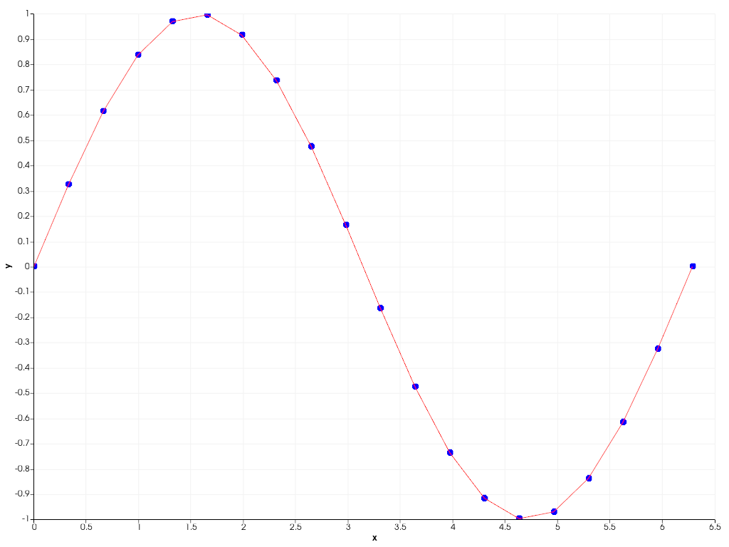
Plot a simple sine wave as a scatter and line plot.
>>> import pyvista as pv
>>> import numpy as np
>>> x = np.linspace(0, 2 * np.pi, 20)
>>> y = np.sin(x)
>>> chart = pv.Chart2D()
>>> _ = chart.scatter(x, y)
>>> _ = chart.line(x, y, color='r')
>>> chart.show()
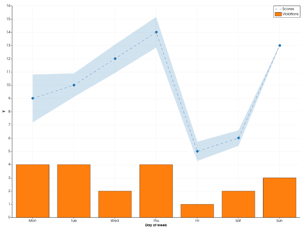
Combine multiple types of plots in the same chart.
>>> rng = np.random.default_rng(1)
>>> x = np.arange(1, 8)
>>> y = rng.integers(5, 15, 7)
>>> e = np.abs(rng.normal(scale=2, size=7))
>>> z = rng.integers(0, 5, 7)
>>> chart = pv.Chart2D()
>>> _ = chart.area(x, y - e, y + e, color=(0.12, 0.46, 0.71, 0.2))
>>> _ = chart.line(x, y, color='tab:blue', style='--', label='Scores')
>>> _ = chart.scatter(x, y, color='tab:blue', style='d')
>>> _ = chart.bar(x, z, color='tab:orange', label='Violations')
>>> chart.x_axis.tick_locations = x
>>> chart.x_axis.tick_labels = [
...     'Mon',
...     'Tue',
...     'Wed',
...     'Thu',
...     'Fri',
...     'Sat',
...     'Sun',
... ]
>>> chart.x_label = 'Day of week'
>>> chart.show()
Used In#
API Examples
AreaPlot(1 use)AreaPlot.brush(1 use)AreaPlot.color(1 use)AreaPlot.label(1 use)AreaPlot.line_style(1 use)129 more
AreaPlot.line_width(1 use)AreaPlot.pen(1 use)AreaPlot.toggle(1 use)AreaPlot.update(1 use)AreaPlot.visible(1 use)AreaPlot.x(1 use)AreaPlot.y1(1 use)AreaPlot.y2(1 use)Axis.behavior(1 use)Axis.grid(1 use)Axis.grid_pen(1 use)Axis.label(1 use)Axis.label_size(1 use)Axis.label_visible(1 use)Axis.log_scale(1 use)Axis.margin(1 use)Axis.pen(1 use)Axis.range(1 use)Axis.tick_count(1 use)Axis.tick_label_size(1 use)Axis.tick_labels(1 use)Axis.tick_labels_offset(1 use)Axis.tick_labels_visible(1 use)Axis.tick_locations(1 use)Axis.tick_size(1 use)Axis.ticks_visible(1 use)Axis.toggle(1 use)Axis.visible(1 use)BarPlot(1 use)BarPlot.brush(1 use)BarPlot.color(1 use)BarPlot.color_scheme(1 use)BarPlot.colors(1 use)BarPlot.label(1 use)BarPlot.labels(1 use)BarPlot.line_style(1 use)BarPlot.line_width(1 use)BarPlot.orientation(1 use)BarPlot.pen(1 use)BarPlot.toggle(1 use)BarPlot.update(1 use)BarPlot.visible(1 use)BarPlot.x(1 use)BarPlot.y(1 use)Brush.color(1 use)Brush.texture(1 use)Brush.texture_interpolate(1 use)Brush.texture_repeat(1 use)Chart2D.active_background_color(1 use)Chart2D.active_border_color(1 use)Chart2D.area(1 use)Chart2D.background_color(1 use)Chart2D.background_texture(1 use)Chart2D.bar(1 use)Chart2D.border_color(1 use)Chart2D.border_style(1 use)Chart2D.border_width(1 use)Chart2D.clear(1 use)Chart2D.grid(1 use)Chart2D.hide_axes(1 use)Chart2D.legend(1 use)Chart2D.legend_visible(1 use)Chart2D.line(1 use)Chart2D.loc(1 use)Chart2D.plot(1 use)Chart2D.plots(1 use)Chart2D.remove_plot(1 use)Chart2D.scatter(1 use)Chart2D.show(1 use)Chart2D.size(1 use)Chart2D.stack(1 use)Chart2D.title(1 use)Chart2D.toggle(1 use)Chart2D.visible(1 use)Chart2D.x_axis(1 use)Chart2D.x_label(1 use)Chart2D.x_range(1 use)Chart2D.y_axis(1 use)Chart2D.y_label(1 use)Chart2D.y_range(1 use)LinePlot2D(1 use)LinePlot2D.brush(1 use)LinePlot2D.color(1 use)LinePlot2D.label(1 use)LinePlot2D.line_style(1 use)LinePlot2D.line_width(1 use)LinePlot2D.pen(1 use)LinePlot2D.toggle(1 use)LinePlot2D.update(1 use)LinePlot2D.visible(1 use)LinePlot2D.x(1 use)LinePlot2D.y(1 use)Pen.color(1 use)Pen.style(1 use)Pen.width(1 use)Plotter.add_chart(1 use)Plotter.remove_chart(1 use)Renderer.add_chart(1 use)Renderer.get_charts(1 use)Renderer.remove_chart(1 use)ScatterPlot2D(1 use)ScatterPlot2D.brush(1 use)ScatterPlot2D.color(1 use)ScatterPlot2D.label(1 use)ScatterPlot2D.line_style(1 use)ScatterPlot2D.line_width(1 use)ScatterPlot2D.marker_size(1 use)ScatterPlot2D.marker_style(1 use)ScatterPlot2D.pen(1 use)ScatterPlot2D.toggle(1 use)ScatterPlot2D.update(1 use)ScatterPlot2D.visible(1 use)ScatterPlot2D.x(1 use)ScatterPlot2D.y(1 use)StackPlot(1 use)StackPlot.brush(1 use)StackPlot.color(1 use)StackPlot.color_scheme(1 use)StackPlot.colors(1 use)StackPlot.label(1 use)StackPlot.labels(1 use)StackPlot.line_style(1 use)StackPlot.line_width(1 use)StackPlot.pen(1 use)StackPlot.toggle(1 use)StackPlot.update(1 use)StackPlot.visible(1 use)StackPlot.x(1 use)StackPlot.ys(1 use)
Gallery Examples
Inheritance#
Wraps vtkChartXY.
Attributes#
Return or set the chart's background color in interactive mode. |
|
Return or set the chart's border color in interactive mode. |
|
Return or set the chart's background color. |
|
Return or set the chart's background texture. |
|
Return or set the chart's border color. |
|
Return or set the chart's border style. |
|
Return or set the chart's border width. |
|
Enable or disable the chart grid. |
|
Return the chart's legend. |
|
Return or set the visibility of the chart's legend. |
|
Return or set the chart position in normalized coordinates. |
|
Return or set the chart size in normalized coordinates. |
|
Return or set the chart's title. |
|
Return or set the chart's visibility. |
|
Return this chart's horizontal (x) |
|
Return or set the label of this chart's x-axis. |
|
Return or set the range of this chart's x-axis. |
|
Return this chart's vertical (y) |
|
Return or set the label of this chart's y-axis. |
|
Return or set the range of this chart's y-axis. |
Methods#
|
Add an area plot to this chart. |
|
Add a bar plot to this chart. |
|
Remove all plots of the specified type from this chart. |
Hide the x- and y-axis of this chart. |
|
|
Add a line plot to this chart. |
|
Matplotlib like plot method. |
|
Return all plots of the specified type in this chart. |
|
Remove the given plot from this chart. |
|
Add a scatter plot to this chart. |
|
Show this chart in a self contained plotter. |
|
Add a stack plot to this chart. |
Toggle the chart's visibility. |